Healthcare Software UX: Three Engineering Realities That Shape User Trust
Dushan Gajikj, Senior Engineering Manager at RLDatix
To meet growing needs for scale, resilience, interoperability, and continuous delivery, healthcare software has evolved from traditional on-premises applications into distributed systems built from multiple services, asynchronous workflows, replicated data stores, and event-driven architectures. These systems have made modern healthcare platforms more powerful and reliable than ever before, but they have also created a new challenge: the system’s reality and the user’s perception of it are not always the same.
When a record appears on one screen but not another, a submitted form continues processing without explanation, or a report takes minutes to generate without indication of progress; users often conclude the software is unreliable. Though the underlying system may be functioning as designed, the product experience has failed to communicate that behavior.
But in healthcare — where interruptions are constant, decisions are time-sensitive, and the cost of confusion can extend far beyond a frustrated user — a perceived system failure can erode user trust in healthcare software just as quickly as a real one. A risk manager investigating an incident, a nurse documenting care during a busy shift, or a quality team preparing for an inspection all interact with software while balancing competing priorities, stress, and an ever-changing operational picture. These users should not be expected to understand distributed systems, asynchronous workflows, or architectural trade-offs to use healthcare software effectively. Research into the role of UX in digital health supports this: when digital development shifts its focus from people to process, adoption and trust both suffer.
The responsibility to translate today’s software architecture into experiences that feel predictable, trustworthy, and forgiving lies with product and engineering teams. This means treating user experience and system architecture not as separate disciplines, but as two sides of the same design problem.
This article explores three key engineering realities that shape the behavior of modern software and examines how thoughtful UX design can make those realities visible in ways that build confidence, trust, and safer interactions with technology.
Reality #1: Distributed Systems Have Intermediate States
One of the most important characteristics of modern distributed systems in healthcare is that many operations do not move directly from “not done” to “done.” Instead, they pass through a series of intermediate states as information flows between services, workflows, databases, and integrations.
Consider a risk manager who submits a new incident report and receives confirmation that it has been saved. At that moment, however, the work may not be complete. The report may still be propagating search indexes, appearing in dashboards, updating analytics, triggering notifications, synchronizing with other systems, or moving through downstream workflows. The submission succeeded, but different parts of the platform may not reflect that change simultaneously.
Many interfaces unintentionally reinforce the idea that a completed action should immediately be reflected everywhere in the system. A confirmation message can create an expectation that dashboards, reports, notifications, and downstream workflows will all reflect the change at the same time. In distributed systems, that is not always true. The challenge is not the existence of intermediate states; it is the expectation of immediate consistency that the experience can inadvertently create.
UX Response: Make System Status Visible
Rather than treating intermediate states as implementation details, good healthcare software UX acknowledges them as part of the experience. A risk manager does not need to understand event streams, synchronization jobs, or distributed workflows, but they do need confidence that the report was accepted, and that progress is occurring — and that confidence comes from visibility.
Interfaces can communicate when information is processing, synchronizing, refreshing, or awaiting completion. They can show when data was last updated, indicate that downstream updates are still underway, or make it clear that a process has begun even if it has not yet reached its final state.
The goal is to create an accurate mental model of what is happening. When users understand the current state of a process, they are far more likely to trust the outcome, even when completion takes time.
Reality #2: Partial and Transient Failures are Expected in Distributed Systems
One of the defining characteristics of modern distributed systems is that failure is treated as an expected operating condition rather than an exceptional event. Networks become unavailable. Services respond slowly. Request time out. Connections are interrupted. Systems retry operations and recover from transient issues automatically. The principle of designing for resilience in distributed systems depends on this assumption: failure will happen, and the system must continue to function.
Consider a nurse submitting a patient’s safety report during a busy shift. The nurse presses Submit; the network connection briefly drops, and there is no immediate confirmation. Unsure whether the report was received, the nurse presses Submit again.
From the user’s perspective, it was a question of whether the report went through. But from the system’s perspective, a more complicated problem is now unfolding. Multiple requests may arrive. Some may succeed while others fail. Retries may occur automatically. The platform must determine whether these requests represent one action or several.
Distributed systems are designed for this situation. Request deduplication, idempotency, retries, compensation mechanisms, and recovery workflows all exist because engineers expect uncertainty. The challenge is that many user experiences do not.
UX Response: Make Recovery Safe and Visible
The most resilient user experiences approach the situation differently. Instead of treating retries as mistakes, they treat them as normal behavior. Users should be able to safely retry when confidence is lost. If an action has already been completed, the system should clearly communicate that state. If a process is still underway, the product should explain what is happening and what the user should do next. This shifts the purpose of error handling — rather than simply reporting problems, the interface becomes part of the recovery process.
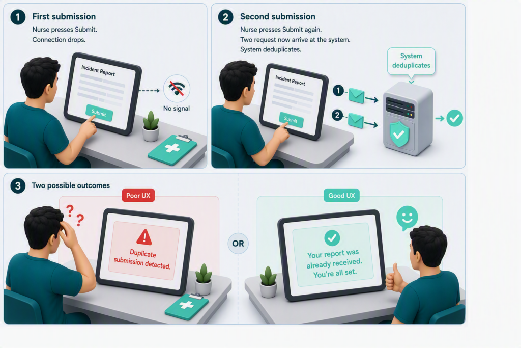
A useful question for designers is not, “How do we display errors?” but rather, “How do we help users continue making progress?” Recovery paths, retry options, draft preservation, resumable workflows, and clear status communication all reinforce the same message: the user’s work is safe.
In fact, these often create a stronger perception of healthcare software reliability than attempting to hide failures altogether. Users rarely expect software to be perfect. They do expect it to help them recover when something goes wrong.
In distributed systems, resilience comes from continuing to make progress despite failure. The same principle applies to user experience. Trust grows when users know that a temporary problem does not mean they have to start over.
Reality #3: Long-Running Work Needs Visible Progress
Modern software often creates the impression that resources are limitless. Users can request reports, launch workflows, import data, generate exports, run searches, and trigger AI-powered analysis with the click of a button. Behind the scenes, however, every system operates within finite limits. CPU, memory, storage, and network bandwidth must be shared across thousands of concurrent users and workloads.
When a quality leader generates an organization-wide safety report containing years of incident, staffing, and compliance data, the request appears simple: click Generate Report and wait for the file. In the background, the system begins to aggregate data from multiple sources, perform calculations, format the results, and generate a document.
Because these workloads consume significant computing resources, they are rarely executed immediately. They are often placed into queues where work can be processed safely without impacting the performance of the rest of the platform.
But the challenge is that users rarely see any of these. They are shown a spinner, a loading animation, or no feedback at all while work progresses behind the scenes. From their perspective, they requested a report and now nothing appears to be happening. The system knows that the request was accepted, queued, and waiting for processing resources, but the user knows only that they are waiting.
The result is predictable. Users refresh the page, repeat the action, generate duplicate requests, or assume the product has failed. What begins as a resource-management strategy becomes a trust problem.
UX Response: Make Waiting Understandable
Good UX treats capacity constraints as part of the user experience rather than an implementation detail. If work has been accepted but not yet started, users should know that. If processing is underway, users should understand that progress is occurring. If demand is high and work has been queued, the product should communicate that reality clearly rather than pretending everything is happening instantly.
Progress indicators, queue positions, processing stages, notifications when work completes, and the ability to continue working while background tasks run all serve the same purpose: reducing uncertainty.
Importantly, this principle extends beyond report generation. Any operation that depends on limited resources should be designed around the assumption that interruptions, delays, and waiting periods are possible. Saving drafts, preserving user state, retaining completed work, and enabling users to safely return later all acknowledge the same engineering reality: resources are finite, and work does not always happen immediately.
The goal is not to eliminate waiting — the goal is to make waiting understandable. A resilient architecture manages finite resources responsibly, while a resilient user experience helps people understand why.
Conclusion
There is a long-standing belief in product design that complexity should be hidden from users. While generally true, there is an important distinction between hiding complexity and hiding reality.
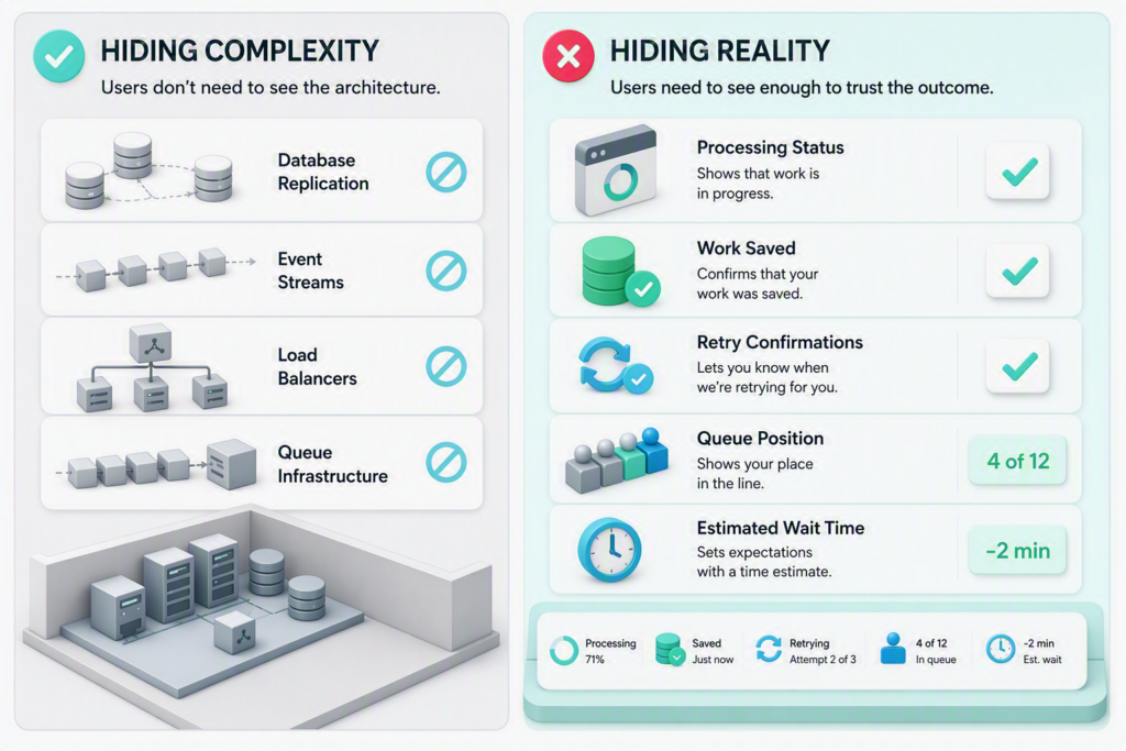
Across all three realities explored in this article, the pattern is remarkably consistent. When healthcare software UX communicates state, supports recovery, and makes progress visible, users can adapt to complexity without needing to understand the underlying architecture. Trust is built by making them predictable. As healthcare systems become more distributed, UX and architecture can no longer be treated as separate disciplines. Both are ultimately solving the same problem: helping people make confident decisions in environments where clarity, reliability, and trust matter most.
At RLDatix, we are already applying these principles when designing new functionality, treating distributed-system states, failures, delays, and recovery as part of the user experience rather than implementation details to hide. As existing functionality is reworked, we bring the same thinking back into the legacy parts of the product, gradually creating a more consistent, transparent, and trustworthy experience.